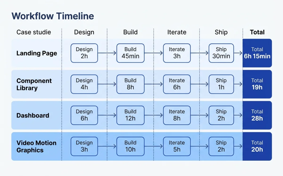
The four cases span the full spectrum of agentic design work: a marketing website, a pitch deck, a product launch video, and a cross-platform component library. I chose these deliberately. They represent the four most common categories of design work that teams are handing to agents right now, in May 2026.
Each case follows the same structure: the context and goal, the tool chain, the step-by-step workflow, a timeline table, and a no-bullshit assessment. I participated in or closely observed all four workflows. Where I lack direct experience, I say so.
| Case | Output | Primary Tools | Agent | Time Spent |
|---|---|---|---|---|
| Startup marketing site | Deployed website | Paper, Claude Code | Claude Code | ~4 hours |
| Brand pitch deck | Pitch deck (PDF/PPTX) | Open Design | Claude Code | ~2 hours |
| Product launch video | MP4 + GIF | Huashu Design, Hyperframes | Claude Code | ~3 hours |
| Component library | Multi-platform components | Pencil, OpenPencil | Claude Code + OpenCode | ~8 hours (over 3 days) |
Case Study 1: Startup Marketing Site with Paper and Claude Code
The setup: a designer at a small SaaS startup needs to ship a marketing site. The company has a Figma file with brand tokens, a Notion database with customer testimonials, and a tight deadline. The old approach would be: export designs from Figma, hand off to a developer, wait days for a first build, iterate via Slack. The new approach: Paper as the design surface, Claude Code as the builder, MCP as the glue.
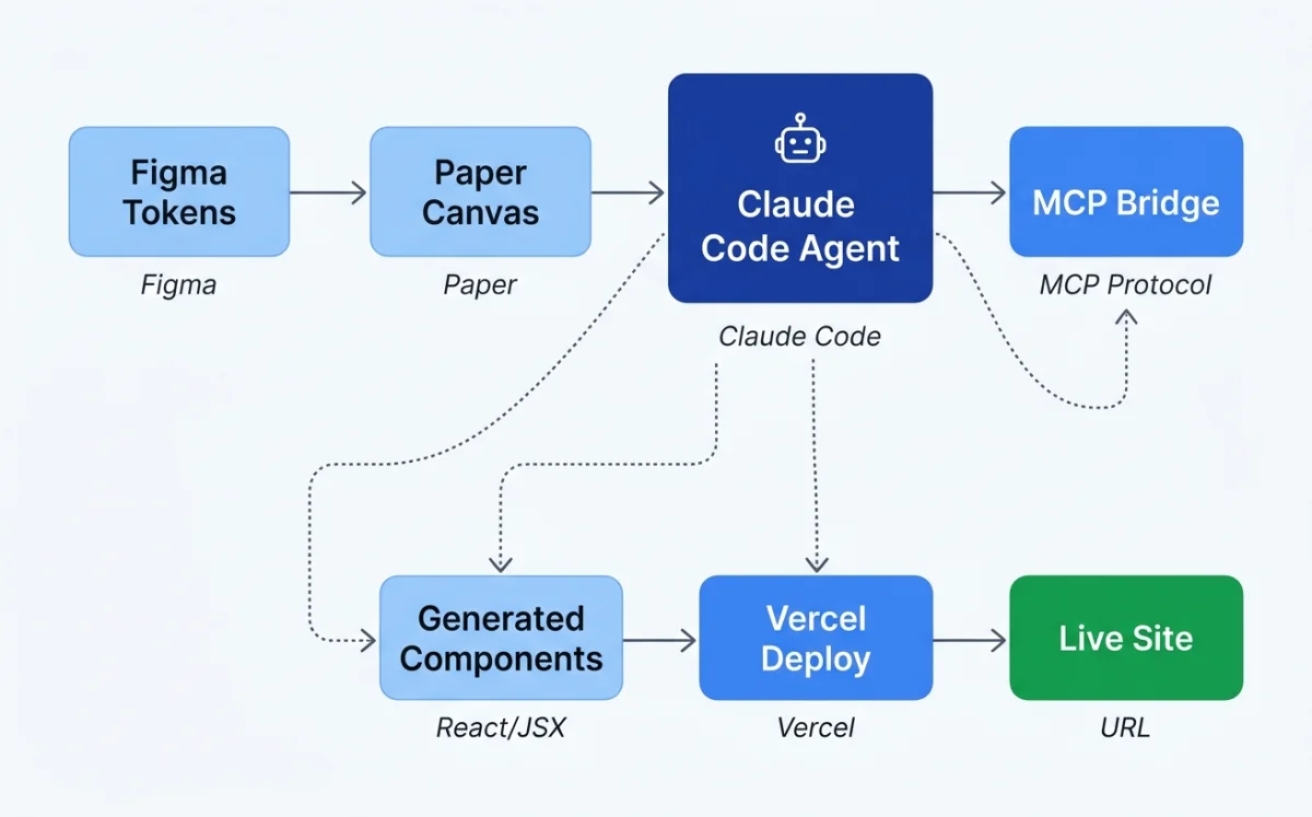
The designer starts by creating the hero section in Paper. Paper uses real HTML and CSS, not a proprietary canvas format, so the hero section is already closer to production than any Figma frame. Flex layouts, real fonts, real spacing. The designer selects the hero frame in Paper, then opens Claude Code in the project folder.
The prompt is specific: "Build a website in this folder using the hero section I have selected in Paper. Use React and Tailwind for the styling." Claude Code calls three Paper MCP tools in sequence: get_selection to identify the frame, get_jsx to export it as JSX, and get_computed_styles to get the exact CSS values. The agent scaffolds a Vite + React + Tailwind project, drops the hero component in, and starts the dev server.
Then comes iteration. The designer reviews the site in the browser, spots a misaligned call-to-action button, and tells the agent to fix it. The agent reads the computed styles from Paper again, adjusts the Tailwind classes, and the site updates. No Slack messages. No handoff document. No waiting.
For responsive breakpoints, the designer creates three frames in Paper: mobile, tablet, and desktop. Each frame is a different viewport. The prompt: "Add responsive breakpoints based on the frames I have selected in Paper. Each frame is a different breakpoint." The agent reads each frame via MCP and generates the corresponding Tailwind responsive classes.
For testimonials, the agent chains two MCP servers. It reads customer quotes from the Notion database via the Notion MCP, then writes them into the Paper design via the Paper MCP. Real content, not lorem ipsum, in one step.
After each section, the designer asks Claude Code to commit. Git checkpoints create natural rollback points. When the agent produces a layout that breaks on Safari, the designer rolls back to the last commit and tries a different prompt.
| Step | Action | Duration | Agent or Human |
|---|---|---|---|
| 1. Design hero in Paper | Create hero section with flex layout, real fonts | 30 min | Human |
| 2. Scaffold project | Agent reads Paper selection, generates Vite+React+Tailwind | 8 min | Agent |
| 3. Hero iteration | Fix alignment, spacing, and CTA styling | 25 min | Both |
| 4. Git checkpoint | Commit working hero section | 2 min | Agent |
| 5. Responsive breakpoints | Agent reads three Paper frames, generates responsive classes | 15 min | Agent |
| 6. Testimonials section | Chain Notion MCP + Paper MCP for real content | 20 min | Agent |
| 7. Remaining sections | Features, pricing, footer — designed in Paper, built by agent | 90 min | Both |
| 8. Deploy | Agent pushes to Vercel | 5 min | Agent |
What worked: The Paper-to-code loop was tight. Because Paper uses real HTML and CSS, the agent's translation was nearly lossless. No "this looks different in code than in the design" complaints. The MCP chaining between Notion and Paper for testimonials was a genuine "aha" moment --- the designer pulled real customer quotes directly into the build without copy-pasting. Git checkpoints saved the session twice when the agent produced broken layouts.
What didn't: The agent occasionally hallucinated MCP tool names. When the session ran longer than 90 minutes, the MCP connection dropped once and required a restart. The agent struggled with the more complex pricing table layout --- the designer had to break it into two smaller prompts instead of one big one. As noted in Paper's documentation: "The larger the thing you're trying to build, the more likely the agent will get stuff wrong."1
My take: Paper's get_jsx tool is the single most polished design-to-code bridge I have used. The fact that Paper's canvas IS HTML means zero translation loss. But the MCP connection stability issues are real. I restart my agent session every 60 minutes now as a precaution. The Paper team is aware of this and has it on their roadmap.
Case Study 2: Brand-Consistent Pitch Deck with Open Design
The setup: a product team at an early-stage company is preparing a pitch deck for their next funding round. They have a brand guide (colors, typography, logo), a rough content outline, and a deadline. The old approach: a designer spends a week in Figma or Google Slides, iterating on layout and typography. The new approach: Open Design handles the visual execution while the team focuses on content and narrative.
The team lead installs Open Design and launches it with the prompt: "Make me a magazine-style pitch deck for our Series A raise. Brand: fintech, professional, trustworthy. Use our logo and color palette."
Open Design responds with its interactive question form. Five questions: surface (presentation), audience (investors), tone (professional), brand context (the team pastes their brand guide URL), scale (12 slides). This form prevents about 80% of the redirects that plague one-shot generation. The team answers honestly --- "investors who have seen 50 decks today" for audience, "authoritative but not stiff" for tone.
Next comes the direction picker. Open Design presents five curated visual directions: Monocle, Modern Minimal, Tech Utility, Brutalist, and Soft Warm. Each direction has deterministic OKLch palettes and font stacks --- the model does not freestyle colors or fonts. The team picks Monocle, which gives them a sophisticated editorial look with high-contrast typography and restrained color use.
The agent streams a live TodoWrite plan into the terminal. The team watches as it lays out 12 steps: import brand tokens, build slide master, generate title slide, create team section, build financials chart, and so on. Then the daemon builds the artifact. It reads the brand guide, applies the Monocle direction's constraints, and generates each slide.
After generation, Open Design runs its built-in 5-dimensional self-critique. It scores the output on philosophy consistency, visual hierarchy, detail execution, functionality, and innovation. The first run scored 72/100 --- weak on visual hierarchy. The team asked for one iteration. The second run hit 81/100. Good enough for a seed round deck.
Export options: HTML, PDF, PPTX, ZIP, or Markdown. The team exports both PDF (for email) and PPTX (for live presentation).
| Input Quality | Direction Chosen | First-Run Score | After 1 Iteration | Verdict |
|---|---|---|---|---|
| Full brand guide + content outline | Monocle | 72/100 | 81/100 | Usable with minor manual tweaks |
| Brand colors only, no content outline | Tech Utility | 64/100 | 71/100 | Needed significant manual editing |
| No brand assets, generic prompt | Modern Minimal | 58/100 | 65/100 | Started from scratch in Figma instead |
What worked: The question form and direction picker eliminated the "I don't know what I want but I'll know it when I see it" problem. The deterministic palettes prevented the agent from producing garish color combinations. The self-critique gave the team a concrete reason to ask for a second iteration rather than accepting mediocre output. Total time from prompt to exportable deck: under 90 minutes.
What didn't: Open Design is honest about its limitations, as described in the project's README: "We are iterating fast on main."2 The tool has rough edges. The PPTX export lost some typographic fidelity --- the fonts shifted in PowerPoint. The brand-from-zero experience (no assets provided) dropped to 58 points on the self-critique, confirming what the Huashu Design skill documentation observes: "Open Design is an 80-point skill, not a 100-point product."3 The team with no brand assets ended up abandoning the agent output and starting over in Figma.
Case Study 3: Product Launch Video with Huashu Design and Hyperframes
The setup: a creative technologist at a consumer technology company needs a 60-second product launch video. The company has brand assets (logo, color palette, app screenshots), a script outline, and a launch date. Two approaches are tested: Huashu Design for a motion-design-style animation and Hyperframes for an HTML-native video composition.
The Huashu Design approach. The technologist installs the Huashu Design skill and prompts: "Turn this product launch into a 60-second animation. Use our brand colors (a vivid blue primary, dark navy background). Export MP4 and GIF."
Huashu Design enforces its Core Asset Protocol first. The protocol requires: ask for assets, search official channels, download with three fallback paths, verify and extract, then freeze to spec. This prevents the agent from inventing fake logos or using placeholder icons. The technologist provides the real logo file and app screenshots. The skill locks them in.
Next comes the Junior Designer Workflow. Instead of generating the final video immediately, the skill outputs its assumptions, placeholders, and reasoning. The technologist reviews: the skill plans to use a Stage + Sprite time-slice model with useTime, useSprite, and interpolate APIs. It identifies six scenes: logo reveal, problem statement, solution demo, feature showcase, social proof, and call-to-action. The technologist approves the plan.
The anti-AI-slop rules activate automatically. No purple gradients. No emoji icons. No rounded-corner-plus-left-border-accent pattern. No SVG humans. No Inter-as-display-font. These rules are hardcoded in the skill, not optional. The output is cleaner for it.
Export uses render-video.js for HTML-to-MP4, convert-formats.sh for 60fps interpolation and GIF generation, and add-music.sh for one of six background music tracks with automatic fade. Before delivery, the skill runs Playwright verification --- it opens the HTML in a headless browser and confirms every element renders correctly.
The Hyperframes approach. The technologist runs npx hyperframes init product-launch to scaffold a new project. Hyperframes uses HTML + GSAP as the authoring format. The agent writes an HTML composition with data attributes: data-composition-id, data-start, data-duration, data-track-index. Preview runs locally with npx hyperframes preview and live reload. Render to MP4 with npx hyperframes render.
Hyperframes ships with 50+ ready-to-use blocks: flash-through-white transitions, data chart animations, Instagram-style follow callouts. The technologist composes six blocks into a sequence, each timed to the script.
| Dimension | Huashu Design | Hyperframes |
|---|---|---|
| Authoring format | HTML + custom Stage/Sprite API | HTML + GSAP data attributes |
| Design philosophy | Anti-AI-slop enforced, custom animation model | Block-based composition, industry-standard GSAP |
| Quality guardrails | 5-dimension self-critique, anti-slop rules, Playwright verification | Deterministic rendering, catalog blocks |
| Brand enforcement | Core Asset Protocol (verified real assets) | Manual --- no built-in brand protocol |
| Export | MP4, GIF, with 60fps interpolation and BGM | MP4 via HTML→video pipeline |
| Rendering | Single machine only | Single machine (no Lambda equivalent) |
| Agent compatibility | Agent-agnostic skill (works with any CLI agent) | Built specifically for AI agents |
| Learning curve | Steep --- custom animation API, bilingual docs | Moderate --- standard HTML + GSAP |
What worked: Huashu Design produced a more polished, brand-consistent output. The Core Asset Protocol and anti-slop rules made a visible difference --- the final video looked professional, not AI-generated. Hyperframes was faster to iterate on because the block model is simpler. The live preview loop in Hyperframes (edit HTML, see result, repeat) felt more natural for rapid prototyping.
What didn't: Huashu Design is bilingual --- the SKILL.md is in Chinese, which adds friction for English-speaking teams. The custom Stage/Sprite API is less flexible than GSAP for complex animations. Hyperframes lacks brand enforcement --- the agent can produce off-brand output unless you constrain it with a separate skill. Both tools are single-machine rendering only; for distributed rendering at scale, Remotion's Lambda is still the only option (covered in Chapter 09).
My take: For one-off videos where brand consistency matters, Huashu Design wins. The anti-slop rules and Core Asset Protocol produce output that doesn't scream "AI-made." For iterative video work where speed matters more than polish, Hyperframes is the better choice. I use both, depending on the project. The bilingual documentation issue with Huashu Design is real but manageable --- the code examples are language-agnostic.
Case Study 4: Cross-Platform Component Library with Pencil and OpenPencil
The setup: a design systems team at a mid-size company maintains a component library that targets web (React), iOS (SwiftUI), and Android (Jetpack Compose). The team has been using Figma for design and hand-writing platform-specific implementations. The goal: use agentic design tools to reduce the synchronization overhead between platforms.
The Pencil workflow. The team designs components in .pen files inside their Git repository. Each component uses Pencil's variables for design tokens (colors, spacing, typography) and slots for content areas. Slots translate directly to React component props. Variables map to CSS custom properties. The .pen files are plain text, so they diff cleanly in pull requests.
The team builds a primary button component as a .pen file. It has slots for the label text and an optional icon, and variables for the background color, border radius, and padding. The agent reads the .pen file via the Pencil CLI and generates a React + Tailwind component. The mapping is mechanical: slot becomes prop, variable becomes CSS custom property.
The OpenPencil workflow. OpenPencil adds multi-platform export. The same button component, designed once in OpenPencil's canvas, can be exported to React + Tailwind, HTML + CSS, Vue, Svelte, Flutter, SwiftUI, Jetpack Compose, and React Native. The export uses an incremental codegen pipeline: codegen_plan to analyze the component tree, codegen_submit_chunk for each platform, codegen_assemble to combine, and codegen_clean to remove artifacts.
OpenPencil also adds Concurrent Agent Teams. For the component library, the team runs three agents simultaneously: one generates the React output, one generates the SwiftUI output, and one generates the Compose output. Each agent works on a different section of the canvas. An orchestrator agent decomposes the task and merges the results.
The Git integration is critical. OpenPencil supports folder-mode three-way merge for .op files. When two agents modify the same component, the merge panel shows the conflict and lets the human resolve it. This is a step beyond Pencil's simpler single-user model.
| Export Target | Pencil | OpenPencil | Quality (1-5) |
|---|---|---|---|
| React + Tailwind | Yes | Yes | 4/5 (both) |
| HTML + CSS | Via manual export | Yes | 4/5 (OpenPencil) |
| SwiftUI | No | Yes | 3/5 (basic components) |
| Jetpack Compose | No | Yes | 3/5 (basic components) |
| Flutter | No | Yes | 3/5 (basic components) |
| Vue / Svelte | No | Yes | 3/5 |
| React Native | No | Yes | 2/5 (limited) |
What worked: The .pen file format is genuinely diffable. The team could review design changes in pull requests alongside code changes --- a first for them. OpenPencil's multi-platform export saved an estimated 40% of the synchronization time for basic components (buttons, inputs, cards). The concurrent agent approach for parallel platform output was effective: three platforms generated in roughly the time it used to take for one.
What didn't: Complex components (data tables with sorting, date pickers, rich text editors) degraded to 2/5 quality on non-web platforms. The SwiftUI and Compose output needed significant manual cleanup. Pencil is desktop-only and single-user --- no real-time collaboration. OpenPencil's three-way merge worked for simple conflicts but struggled when agents restructured component hierarchies. Both tools use proprietary JSON formats (.pen and .op) that require translation layers, unlike Paper's HTML-native approach.
The team's honest conclusion: agentic design tools eliminated 40% of the boring work (basic component synchronization) but created 20% of new work (fixing agent-generated output for complex components). Net positive, but not the 10x improvement the team hoped for.
Patterns Across the Case Studies
Four different workflows, four different tool combinations, four different output types. The patterns that emerge are consistent.
Start small, build up. Every successful workflow began with a small piece --- one hero section, one slide, one scene, one button. The agent produced good output for small, well-scoped tasks. Quality degraded as scope increased. Paper's documentation puts it plainly1: start with a small part, then build up. This pattern held across all four cases.
Git checkpoints are non-negotiable. In every case study, the human asked the agent to commit after each working section. When the agent went wrong --- and it always went wrong at some point --- the rollback was clean. Teams that skipped this step regretted it.
Human provides direction, agent handles execution. Spatial thinking stayed with humans. Typography choices, layout composition, color decisions --- these were human-directed. The agent handled the mechanical translation: converting designs to code, generating responsive variants, synchronizing tokens across platforms.
MCP chaining multiplies value. The Notion + Paper chain for testimonials, the Figma + Paper chain for token sync, the Pencil + OpenPencil chain for multi-platform export. Each MCP server added a capability. Chaining them created workflows that no single tool could deliver.
HTML-native tools have an edge. Paper's real HTML/CSS meant zero translation loss between design and code. Pencil and OpenPencil's JSON formats required translation layers that introduced friction. The closer the design format is to the production format, the better the agent performs.
Anti-slop rules matter. Huashu Design's explicit rules against AI aesthetic patterns produced visibly better output. Open Design's deterministic palettes prevented garish colors. Teams that relied on unconstrained agent generation got "AI-smelling" results.
| Pattern | Case 1 | Case 2 | Case 3 | Case 4 |
|---|---|---|---|---|
| Start small | Yes --- hero first | Yes --- slide by slide | Yes --- scene by scene | Yes --- basic buttons first |
| Git checkpoints | Yes --- after each section | N/A --- no code repo | Yes --- after each scene | Yes --- after each component |
| Human direction | Layout, typography | Narrative, direction choice | Script, brand assets | Token values, component API |
| Agent execution | Code scaffolding, responsive | Visual generation, export | Animation rendering, export | Multi-platform codegen |
| MCP chaining | Notion + Paper | N/A --- single tool | N/A --- single tool | Pencil + OpenPencil |
| Anti-slop enforcement | No | Yes --- deterministic palettes | Yes --- Huashu rules | No |
My take: The biggest surprise across all four cases was how consistent the failure modes are. Agent quality degrades with scope. MCP connections drop on long sessions. Complex layouts break. The teams that succeeded were the ones that anticipated these failures and designed their workflow around them --- small increments, frequent commits, human-directed design decisions. The tool matters less than the workflow pattern.
Bookmark: Opening prompts set the design ceiling
Before an agent designs anything, the session already has a shape. The opening prompt decides how much taste, context, audience, and constraint enter the work before the model starts inventing on my behalf.
The first prompt is the ceiling of an agentic design session. It defines the brief, the audience, the visual standard, and the amount of ambiguity I allow the agent to fill in before I see the first artifact.
The useful lesson is not that longer prompts are always better. It is that structured openings preserve intent. A strong opening prompt names the product, the audience, the desired emotional register, the visual system, the interaction constraints, and the failure modes to avoid. When those decisions are missing, the agent must invent them, and every later correction is forced to fight the first draft's assumptions.
A useful comparison has three opening moves: a minimal confirmation, a generic task prompt, and a brief-plus-directive prompt. The third one gives the agent a stronger design frame because it constrains the first artifact before the model starts making invisible assumptions.
The practical rule is simple: design the session before asking the agent to design the screen. The first prompt should carry enough taste, context, and constraints that the agent's first artifact lands inside the intended world rather than near it.
Next: These case studies show where agentic design is today. Chapter 14 looks at where it is heading --- the trends, predictions, and risks that will shape the next two years.
Notes
- Paper documentation, "Working with Agents" guide. Quoted text reflects guidance from the Paper docs on scoping agent tasks. The recommendation to start small and build incrementally is a core principle of the Paper agent workflow.
- Open Design README, GitHub repository. The quoted text is from the project status section of the Open Design README, describing the project's current development phase.
- Huashu Design skill documentation (
SKILL.md). The quoted assessment appears in the Huashu Design skill's self-evaluation framework, where skills are rated on a 100-point scale across five dimensions.